New Logo for a New Moffitt
In 2016 we rolled out new products and redefined what Moffitt Logo was as a company. We updated our website, rolled out a new catalog, and made some big steps in our branding. All that said and done, we never quite updated our logo to match. Now that we’re entering a new decade, we’ve totally reinvented our logo to better match our brand and better represent our message of Natural Ventilation Solutions.
The Moffitt Natural Solutions “Ring”

The boldest part of the new logo is the four-color ring logomark. The unique shape of the ring provides a unique silhouette. In black and white, or by itself, the logomark will be instantly identifiable. Each part of the ring stands for one of the main pillars of the Moffitt product line.
- Green – natural ventilation | Rises like warm air in a building from the floor to the ceiling. Maintains the Moffitt Green from before.
- Gray – heat & smoke control | Like smoke from a fire, the icon floats from the middle of the room and expands towards the ceiling.
- Yellow – natural daylighting | Shines down from the sky into the space below.
- Blue – natural cooling | Flows from the rooftop down toward the ground.
Each of the four diverse natural solutions categories come together to form one cohesive “natural ventilation solutions” line. The colors and shapes of each product line live in the company logo itself. This presents a single 360° product message. Now everyone will be able to remember who Moffitt is and what we do, just by looking at the logo.
The Moffitt Word Mark
The biggest change in Moffitt name is that it’s now just Moffitt. No “corporation”, no “mechanical” just Moffitt. All the Moffitt divisions are now unified under one identity. Not only does this simplify things in the eyes of our customers, its also easier to read and write. The whole logo is now more concise and more impactful.
The mark utilizes a customized version of the Roboto Slab typeface to give the name a bold presence and a unique look. The black helps the logo standout on any background, while the “Natural Ventilation Solutions” tagline is a thinner sans-serif type in “Moffitt Green”.
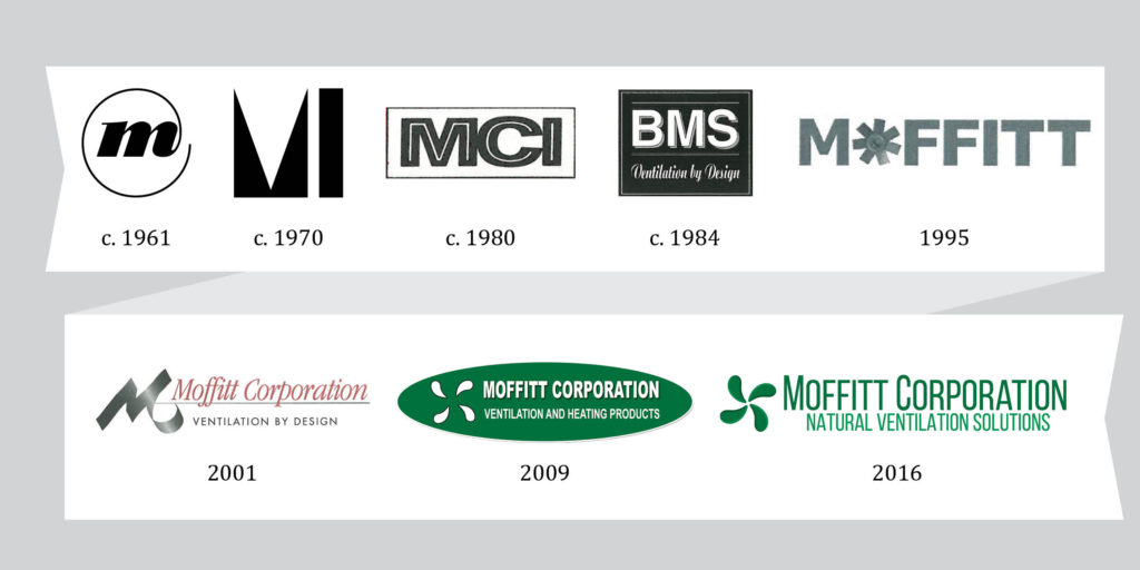
Moffitt Logo History
In crafting the new Moffitt logo, we looked at the history of the Moffitt brand. We wanted to maintain the Moffitt feel while also modernizing the look for the next decade.

As mentioned above keeping the “Moffitt Green” was necessary. The 2009 logo made it the focal point of the brand. Over the last decade the marketplace has come to look for that “Moffitt Green”. The color is a powerful and stands out in the industrial market. From a design standpoint however, the boldness was limiting. When green was the only color, everything in the Moffitt brand ended up being green. That is why expanding the color pallet was necessary.
Perhaps most importantly is that this new logo pushes our image beyond just a “fan company”. The last few logos focused heavily on the fan. The new ring shape still evokes thoughts of air circulation, but it is more figurative to better suit all of the non-fan products in our line. It now conjures feelings of a green energy cycle and renewal instead of just blowing air. This is a much better fit for Moffitt.
The Future
While we loved our old logo, we felt it was time to update it to better reflect what we do and where we’re going in the future. This new logo brings all three divisions of Moffitt under a single brand with a single message: “Natural Ventilation Solutions”. Whether its design, fabrication, or installation, it’s Moffitt.
